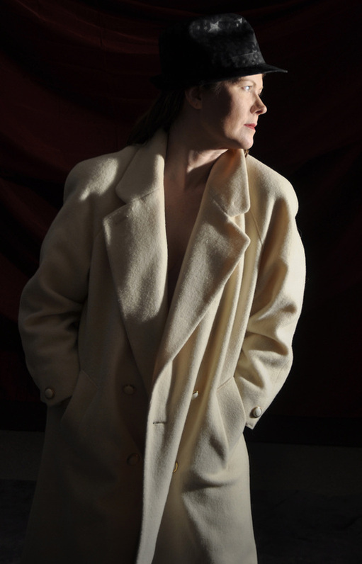
I like the look of a profile with a hat. We weren't too sure about the stars on the fedora, probably should be a plain hat. The fun part about trying things out is being able to see how certain things work or not. I tend to think the stars don't distract, but they do draw attention because of their graphic shape up at the top. The proximity to the face, which is the focal point is perhaps too close to be a comfortable design enhancer. I talk about this all the time with design---entry points---points where your eye goes to first or second or third on a page are important for eye movement across the page or composition. Clumping entry points together isn't always sound in principal--in fact it is often just not good at all(though admittedly just saying this makes me want to find a way to make it work!) The key to driving a viewer's eye to your focal point is to not have confusion within the complexities of your design. Simple is often better, though too simple leads to no one taking notice or staying with the image. So I'll do a little thinking about this star hat before we use it again--there is a place for it for sure--we'll find it. SayerMotter Photograph by Richard Sayer.
 RSS Feed