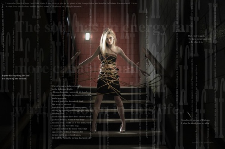
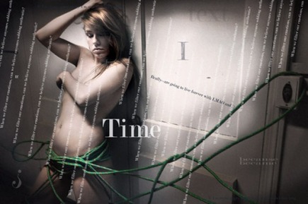
I often complain about newspaper designers who place words and graphics and such over photographs. I'm not one hundred percent opposed to word and images working together--but they have their place. Newspapers communicate and must do so quickly(compared to a contemplative piece on a museum wall). So most of the time I believe a photograph un altered does this better than one with 'stuff' tossed on it. In my private work, drawings, paintings and even photographic work I often include writing in with the images. This is to communicate something beyond just what is within the image--within the frame. But I expect these images to be allowed the time to absorb. Newspaper photography is a great and complex thing, but it still must engage you. Placing boxes of text or even floating text over the top of the image in a newspaper takes away the image's impact. 99.5 to 99.9% of the time a photograph should stand on its own without manipulation or over - designing by the layout folks. An image - to have impact--needs to be clean and not too cluttered on the page. I admit, I hate most modern designed newpapers. I feel they've taken the route of the mountain Dew culture and sort of ruined what is good about news design and news photography. I always feel if we communicate cleanly, simply and most important--honestly. Then we serve our readers to the fullest. Let the layering of imagery and text and design be where it belongs--in introspective pieces on gallery walls where we can take the time to absorb them if we choose, but let newspapers do what they do best--communicate---and do so with the best the staff can offer. These images haven nothing to do with newspapers, but they were ideas I was trying to convey a few years ago. Even though I think I have an idea here--these just didn't communicate well enough. I either need to push it further or learn more from my approach to newspaper photography---not sure. Photographic alterations by Richard Sayer. PS--still failed to bring home the pictures
 RSS Feed